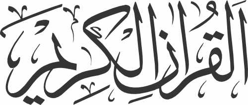
Phrase: Al Quran Ul Karim (القرآن الكريم)
Thuluth Calligraphy Features:
- Elongated and Balanced Proportions: In thuluth calligraphy, each letter of “Al Quran Ul Karim” would be elongated and have a consistent height, creating a harmonious and balanced appearance. The proportions are meticulously crafted to maintain the elegance and readability of the script.
- Smooth Curves and Swirls: The letters in thuluth style are characterized by smooth, flowing curves and intricate swirls that add a sense of fluidity and dynamism to the design. These decorative elements enhance the aesthetic beauty of the phrase and give it a unique character.
- Decorative Flourishes: Thuluth calligraphy often incorporates decorative flourishes and embellishments, such as elongated vertical strokes, ornamental dots, and delicate lines, which add complexity and richness to the design.
- Harmonious Spacing: The spacing between the letters and words is carefully considered in thuluth calligraphy to ensure readability and visual harmony. The letters are spaced evenly, creating a rhythm that flows seamlessly across the phrase.
Imaginary Representation:
Imagine “Al Quran Ul Karim” written in thuluth style calligraphy as a vector design:
- The phrase would be elegantly crafted with elongated, gracefully curved letters.
- Intricate swirls and decorative flourishes would embellish the design, adding depth and complexity.
- The colors chosen for the vector design could range from traditional black ink on white background to more vibrant and contemporary color palettes, depending on the intended use and context.
- The vector design would maintain the fine details and intricacies of thuluth calligraphy, capturing the beauty and essence of this classical Arabic script.
In conclusion, “Al Quran Ul Karim” written in thuluth style calligraphy is a stunning representation of the Holy Quran, embodying the spiritual significance and aesthetic beauty of Islamic art. Whether used in decorative art, religious publications, or architectural designs, this phrase in thuluth calligraphy serves as a powerful reminder of the Quran’s revered status and timeless message.
وصف “القرآن الكريم” بالخط الثلث بالتفصيل:
العبارة: القرآن الكريم
ميزات خط الثلث الفنية:
- نسب متوازنة ومطولة: في خط الثلث، ستكون كل حرف من “القرآن الكريم” مطولًا وله ارتفاع متساوٍ، مما يخلق مظهرًا متناغمًا ومتوازنًا. تتم صياغة النسب بدقة للحفاظ على أناقة ووضوح الخط.
- منحنيات ناعمة ودوائر: تتميز الحروف في خط الثلث بمنحنيات ناعمة وتداخلات معقدة تضفي شعورًا بالسلاسة والديناميكية على التصميم. تعزز هذه العناصر الزخرفية من الجمال الجمالي للعبارة وتمنحها طابعًا فريدًا.
- زخارف فنية: يدمج خط الثلث غالبًا زخارف فنية وتزيينات، مثل السكك العمودية المطولة، والنقاط الزخرفية، والخطوط الرفيعة، التي تضيف تعقيدًا وثراءًا للتصميم.
- توازن في التباعد: يُعتبر التباعد بين الحروف والكلمات بعناية في خط الثلث لضمان الوضوح والتناسق البصري. تُوزع الحروف بانتظام، مما يخلق إيقاعًا يتدفق بسلاسة عبر العبارة.
التمثيل الخيالي:
تخيل “القرآن الكريم” مكتوبًا بخط الثلث كتصميم ناقل:
- سيتم صياغة العبارة بأناقة بحروف مطولة ومنحنيات متدفقة.
- ستزخر التصميم بتداخلات معقدة وزخارف فنية، مضيفة عمقًا وتعقيدًا.
- يمكن أن تتراوح الألوان المختارة لتصميم الناقل من الحبر الأسود التقليدي على خلفية بيضاء إلى لوحات ألوان أكثر حيوية ومعاصرة، اعتمادًا على الاستخدام المقصود والسياق.
- سيحتفظ تصميم الناقل بالتفاصيل الدقيقة والتداخلات في خط الثلث، مُلتقطًا جمال وجوهر هذا الخط العربي التقليدي.
في الختام، “القرآن الكريم” مكتوبًا بخط الثلث هو تمثيل رائع للقرآن الكريم، يجسد الأهمية الروحية والجمال الفني للفن الإسلامي. سواءً كان يُستخدم في الفن التزييني، أو النشرات الدينية، أو التصاميم المعمارية، تُعتبر هذه العبارة في خط الثلث تذكيرًا قويًا بالمكانة المحترمة والرسالة الخالدة للقرآن.
Related posts:
 Surah of Quran Islamic Calligraphy Thuluth Font
 Al Quran Ul Karim Kitabat CDR and EPS Download
 رأس الحكمة مخافة الله vector – thuluth style 2
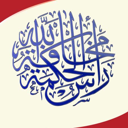 رأس الحكمة مخافة الله vector style 2 – Thuluth Style
 Surah of Quran Islamic Calligraphy Divani Font
 Rabbi Zidni Elma Quran Ayah Calligraphy CDR and EPS Download
 Bismillah Vectors Thuluth Style
 خير الناس أنفعهم للناس Vector CDR, EPS and PNG Download
 Bismillah Vectors Thuluth Style – CDR+AI Files